Northern Lights
Building a design system
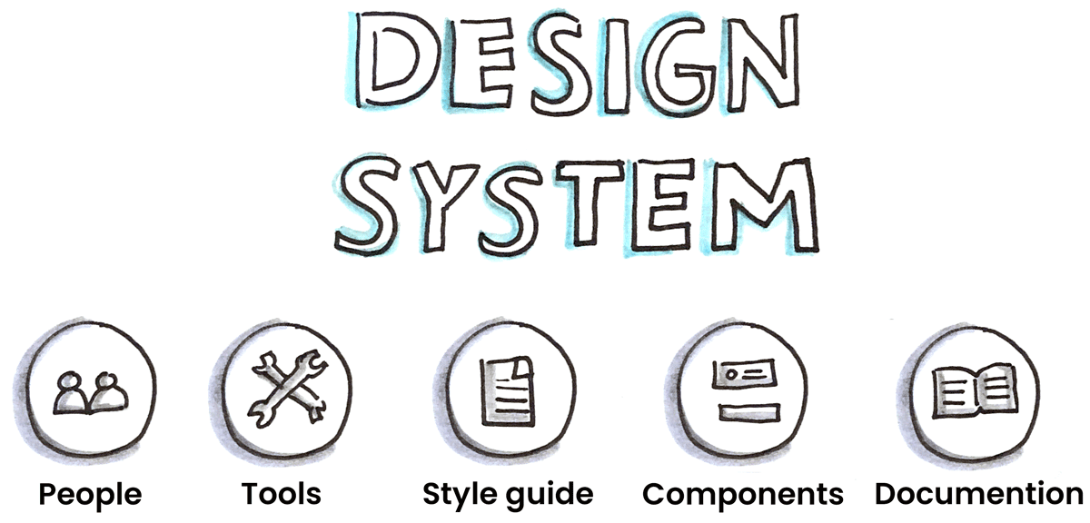
Design systems
Design systems focus on people, fostering communication through a shared language. They ensure UI consistency and streamline development with reusable components, built collaboratively across teams.
I created the Northern Lights design system driven by my passion for design fundamentals like color theory, typography, layout, and hierarchy. This platform allowed me to experiment, build a strong design foundation, and produce more impactful work.
Northern Lights has been invaluable in refining my skills and has enhanced my ability to understand, implement, and establish design systems as a Senior Experience Designer.
Foundation
Documentation is key
Effective documentation is essential for successfully implementing a design system. It involves conducting UI audits, gathering information, and establishing design principles to guide UI elements. Reusable assets like components and patterns ensure consistency across the system.
Comprehensive documentation serves as a central communication hub, promoting universal understanding and easy access for all stakeholders.
UI brand audit

This audit utilizes CSS Stats to visualize a website's UI (stylesheet). The goal is to get started with a UI audit to identify areas that require optimization.
Framework
Bring the design system to life
The name "Northern Lights" reflects the idea of energized electrons creating a captivating natural phenomenon, symbolizing our goal to tell an inspiring brand story that engages users.
Design Principles
- Accessible: Ensure the product is usable by everyone, including those with disabilities.
- Transparent: Provide clear, trustworthy, and relevant information that makes users' lives easier.
- Consistent: Maintain simplicity by making experiences recognizable and intuitive, rather than requiring memorization.
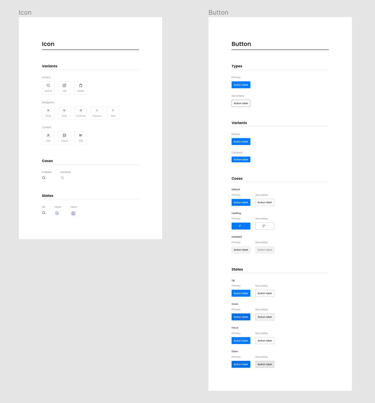
Design system documentation
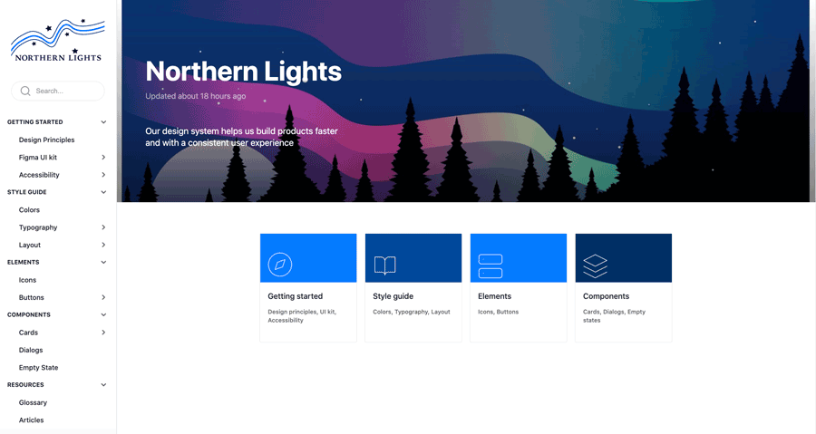
View the completed design system documentation on zeroheight.
Laying the foundation
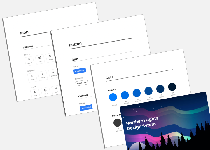
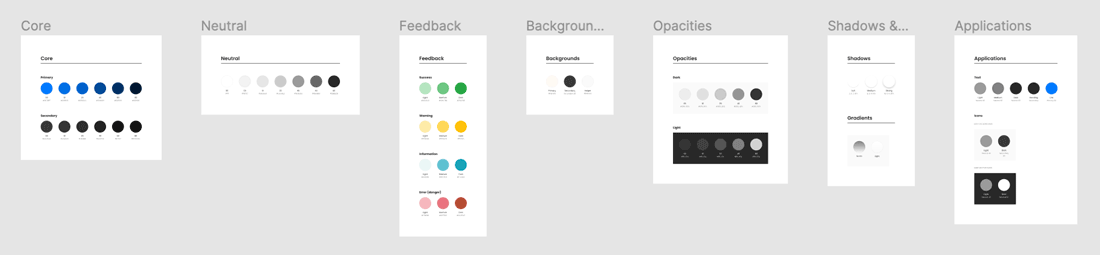
- Style guide. Includes the foundation of the UI like color, type scale, layout, and spacing. Everything that is defined in the style guide is applied to buttons, headers, and backgrounds.
- Elements. Are the smallest tangible piece of a UI. They have minimal structure for buttons and icons.
- Components. Are a central and structural piece of the designs. They consist of grouped elements with more specific structure like cards and dialogs.
- Patterns. Are repeatable solutions to recurring design problems. They can be forms, content, or navigation.
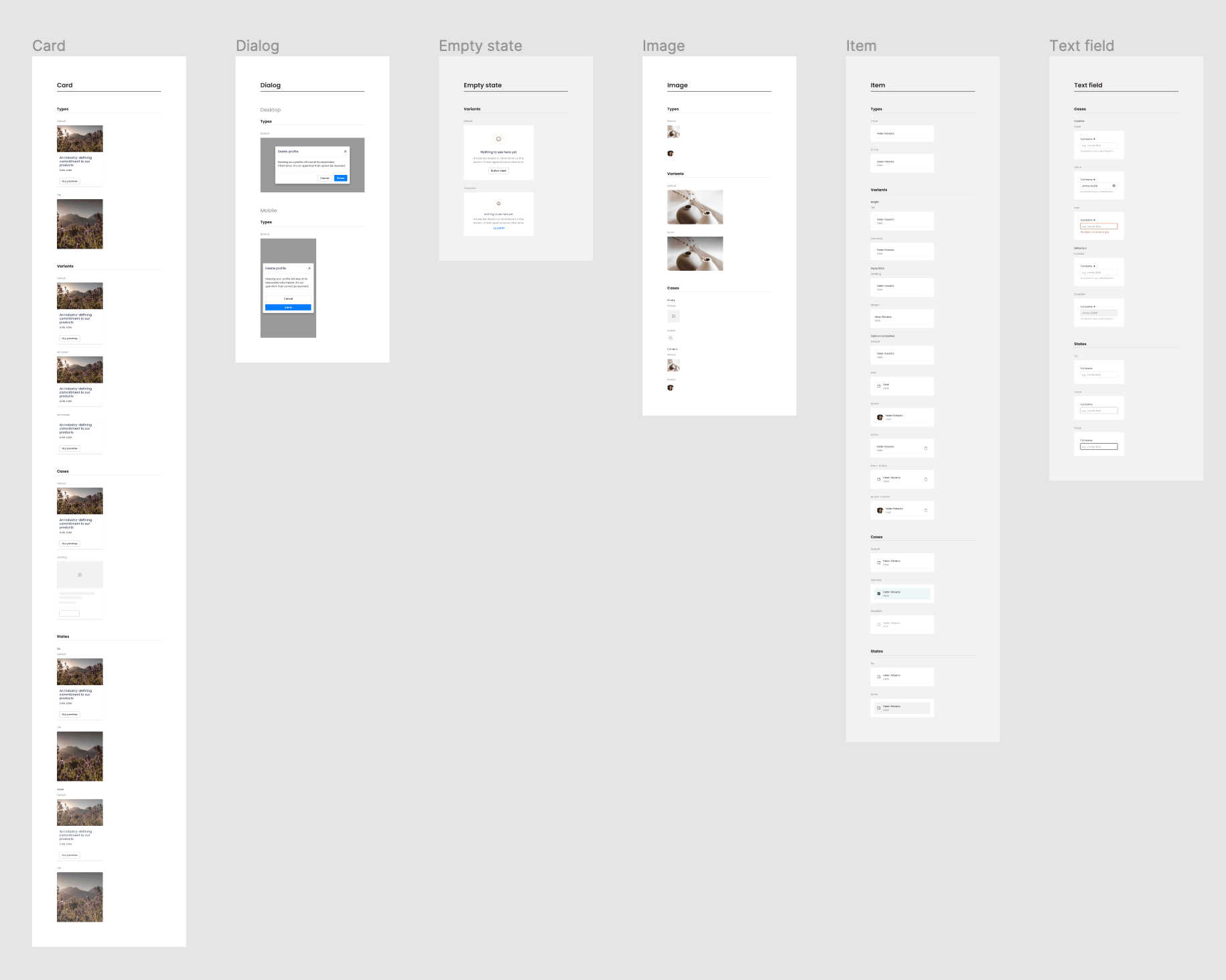
Building the UI
- The UI Kit for the Northern Lights design system was created in Figma.
Scope & Constraints
As part of an online course, I created a design system project that was crucial to my learning. It helped me focus and fully understand the material, especially zeroheight, a valuable tool in my design system efforts. Though I couldn't document design tokens due to time constraints, the experience was transformative, and I’m excited to apply what I've learned in future projects.
- Timeline: 4 weeks (identity, develop, document, and deploy)
- Deliverables: UI, wireframes, and documentation
Tools
- Figma, zeroheight, Adobe CC
Retrospective
What I learned about building and documenting a design system.
Design systems encourage development teams (design/code) to efficiently communicate using the same visual language.
- Documentation is at the heart of a design system.
- Design systems should be treated as a product.
- Evangelizing a design system is key to ensuring everyone understands why the design system was developed and how it will be adopted across the company.
Next steps.
This project does not include the design token documentation. It will be the next step in my documenting process. My goal is to test the elements and components to enforce accessibility issues and iterate as needed until they are compliant with Web Content Accessibility Guidelines (WCAG) 2.1.
Selected Work
Simplifying retirement plan reviewsView user experience project >
Executing a digital campaignView digital campaign project >
Managing the creative processView advertising campaign project >

Delivering a relevant messageView dimensional mail project >
Streamlining the design processView the process >